
book covers & promo posters


In this project I created two book cover designs and two accompanying promotional book reading posters for Herman Hesse’s novel Narcissus and Goldmund. The imagery and type treatment on the covers and posters directly speak to the content of the novel—sophisticated, minimalistic, mysterious, intriguing, and elemental. The black and white cover and poster are entirely hand drawn, and the N color poster and cover are shot using a photographic treatment.

“transparency”
For this poster project I was tasked with creating a composition from collaged city photos that are united in their theme/message.
I chose to focus on the effects of transparent windows in the sunlight creating depth and distorted text. Also, included in the top center above the Centreville Bank and Transparency text (which was added after digitally), is an exploration of my own which employs a similar effect/strategy as the natural light on the shop window.
For the photograph imposed, printed letterform compositions I had created digitally were overlapped and photographed while held to a light source.

typeface
After the complete of the “Transparency” collaged poster, I was tasked with creating a typeface based on the poster’s imagery.
The resulting typeface utilizes overlapping varyingly transparent planes within the letterforms to create depth and dynamism.
The typeface is titled “Transparen-C” as a fun play on words/letters.
Transparen-C Typeface Animation


This is the first in a series of pdf’s I am developing for Claro Workforce Analytics. I was given the numbers/percentages in a raw state in excel, and from there created a visual narrative based on insights from the data. The pdf was one of the first posts on Claro’s new website, and received over 66,000 interactions on the first day of its publishing.
link: https://claro.hr/top-50-diverse-employers/

sketches
& alternate ideas
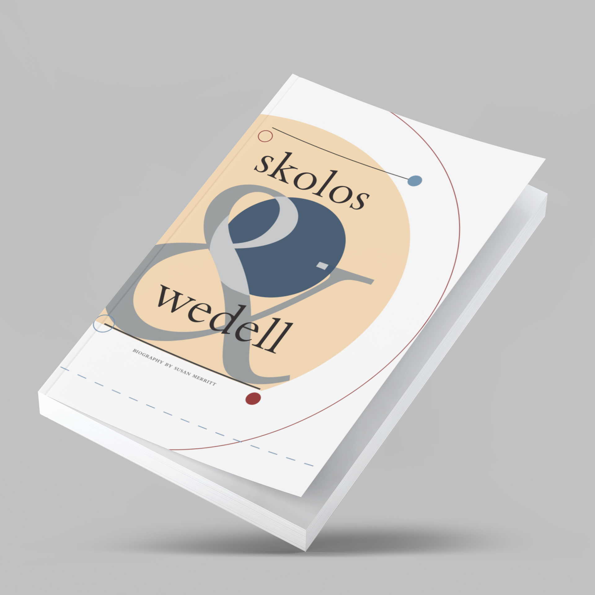


skolos & wedell
typography book
For this project I designed a typographic book showcasing Susan Merritt’s article on AIGA medalists Nancy Skolos and Thomas Wedell. The theme and graphic elements I created are inspired by the work of Skolos and Wedell.
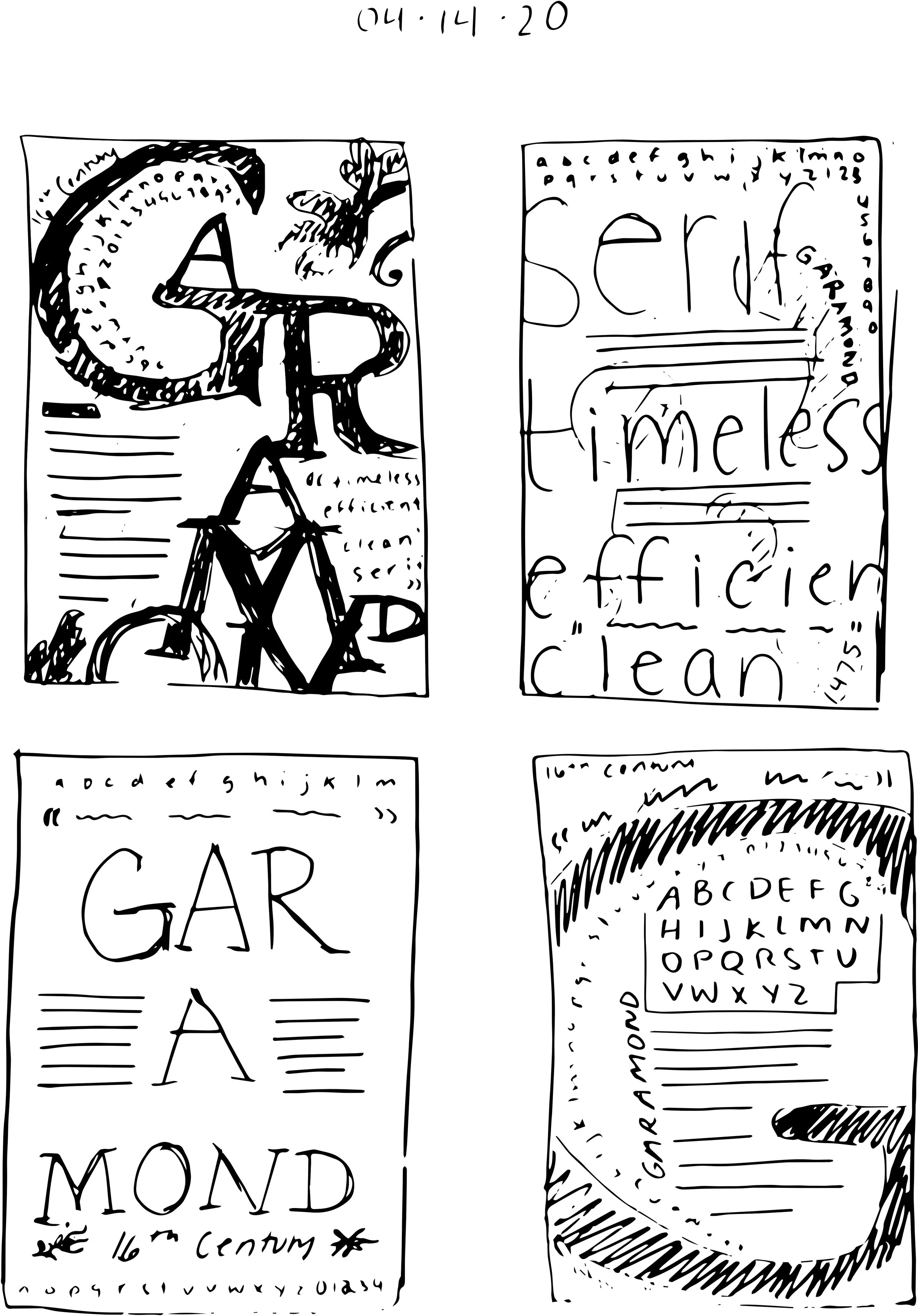
garamond typeface posters
My objective for this poster project was to display the diversity of styles and weights of the typeface Garamond. The poster in the center is a font study/showcase, while the two posters on the outside include a drop quote and additional information about the font.


exploration
font studies and event development
Below are some hand-cut logo explorations and a font I developed for a hypothetical event: the RISD gardening lecture series. The font I created is a playful hand-cut typeface whose terminals reflect the stems of cut flowers. This was not a requirement of the branding project above, but upon my exploration I decided to pursue this project simultaneously.
RISD museum
identity branding project
In the summer of 2019, I took a branding for identity design course at RISD’s Summer Institute for Graphic Design Studies (SIGDS). We were tasked with creating a new identity for the RISD museum. The following slides show the letterpress covers and selected pages from the brand manual I created.


